
Your editor homepage needs to promote your services and entice people to dive deeper into your site. Here’s how.
Your homepage is likely to be the most visited page on your site. Even though it is not necessarily the starting point for every visitor (they may have arrived at your About page or a blog post via Google, for example), it is the web address you promote, and where visitors return if they need to reorient themselves on your site.
Think of your editor homepage like a magazine cover. It is not a place where users will hang out for long, but it needs to showcase the items that are of most interest to them and encourage them to dig deeper. It is, therefore, of vital importance to make it easy to use.
Think of your editor homepage like a magazine cover. It is not a place where users will hang out for long, but it needs to showcase the items that are of most interest to them and encourage them to dig deeper. Share on XHave a clear goal
You will have a number of aims for your site: for example, attract your next quality client, increase subscriber numbers, sell resources or get people to learn more about you, but there will be one primary goal specific to your editing business. Make this goal clear on your editor homepage.
For example, if your main goal is to attract clients, and a secondary goal is to build your mailing list, you will dedicate a large proportion of homepage space to making it clear which type of content you edit, reasons why people should hire you, and testimonials.
The secondary goal can be met too, but don’t let it compete for space with the service-promotion content. Instead of taking up prime real estate with your sign-up form on the homepage, just have a clearly visible button in the header or footer so that it isn’t jostling for pole position.
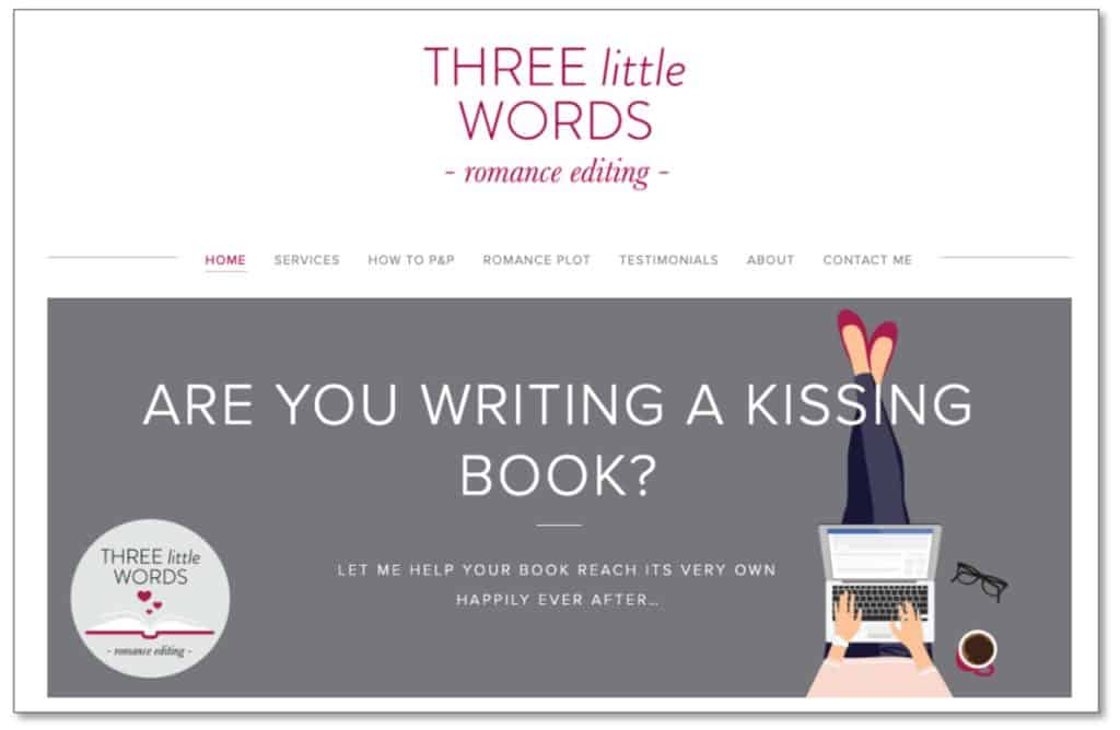
Keep it simple
Don’t feel you have to cram everything in, or visitors will become blind to it all. Consider which parts of your site are of most interest to your audience and make sure these have a homepage spot. Consider the user journeys of your visitors, and put the first steps on your homepage.
Your homepage is valuable real estate. Each piece of content must be working for you. If it isn’t, get rid of it.
Allow scrolling
Since the explosive advent of smartphones and tablets, site visitors expect to scroll.
Give yourself room to include essential content without feeling everything must be at the top of the page (although make sure the call to action – button or link – for your site’s goal is visible when the page first loads).
Say who you are
More than just your name or the name of your business should be at the top of the page. Give visitors a clear, concise idea of your niche.
For example, “Joanna Bloggs, editor of financial content”.
Promote your services
Many visitors will come to your site to find information about your editing services, and promoting their offerings will be the primary site goal for many editors. Put this information front and centre; don’t make people go searching for it.
Outline what you offer and link to your top-level services page. You could also include the testimonial you’re most proud of.
Include a call to action
A call to action is content that induces visitors to act, e.g. a ‘Sign up’ button.
As the most visited page on your site, the homepage is a crucial conversion area, so use it wisely. If you have an email newsletter, make sure people can sign up from your homepage.
Don’t have a welcome message
Show, don’t tell. People don’t need to be told they’re on your site; they already know. Similarly, avoid telling them what they will find on your site. Don’t write copy like: “Welcome to the homepage of Joanna Bloggs. Here you will find…”
Make it clear who you are and what you do in your header, or high up in the page body, and point the way to key content through featured links and calls to action.
People don’t need to be told they’re on your site; they already know. From: Editor homepage – what to put on it and why Share on XCheck for errors
Before you launch your homepage, make sure you check for any typos and errors in grammar, spelling and punctuation. Also, look at the layout on different devices and in different browsers to make sure everything is acting as it should.
Consider hiring a professional web proofreader (I’m one, but it doesn’t have to be me!) to take a look over your homepage, even your whole website. You may be too close to the content and keep glossing over little mistakes that will reduce the credibility of your site and of you as an editor.
Publicise!
Once your editor homepage is something you can be proud of, promote it wherever and whenever you can.
Start here, by leaving a comment with a link to your site. This will increase your domain authority and give you more exposure. And of course, I’d love to take a sneaky peek!



Leave a Reply