
Discover how to structure your editor website to appeal to potential clients and generate enquiries.
So, you’re planning your editor website. Or maybe you already have a website but are looking to make it more appealing to users. How do you come up with a site structure that will appeal to potential clients and help them quickly find what they need?
Think about your primary audience
Structure your editor website according to the needs of your audience, not your own. This is the golden rule of web (and any marketing).
Put yourself in the shoes of one of your key audiences, let’s say a self-published author looking for an editor. They will come to your site with a specific intention. This may be:
- to find out what services you offer
- to discover the cost of your copyediting service
- to find out how to contact you
If you make it easy for them to complete their intended task, it will create a positive, lasting impression on them. They will be more likely to spend time on your site, interact with you (signing up for updates etc) and return.
Make it easy for your website visitors to complete their intended task and they will be more inclined to stay longer and return. From: How to structure your editor website Share on XStreamline your site
If you have a small editor website, it will be easy to keep it neat and logical. Larger sites may need a bit of housekeeping.
If you’re a fairly new editor, or if you don’t offer online information or resources over and above your services, you may simply have the following pages (exact titles can be tweaked to suit your style):
- Home
- About
- Services
- Contact
You may also decide to have a blog on your site (if you’re sure you can dedicate the time to keep it updated regularly), and information about any events you’re hosting or presenting at (webinars, conferences etc). You may have subpages below these top-level pages, for example, a page for each of your services.
If you’re more established, you may have a section dedicated to courses that you offer, books and resources either for sale or as free downloads, information about your podcast, and a portfolio page.
Remove clutter
If your editor website has been around a while, it may have grown larger than it needs to be. Take a moment to consider if you need all your content. Do your visitors really want to know about your favourite wine or where you last went on holiday? Obviously, if these facts directly relate to the kind of content you edit (food and drink, or travel), then feel free to include them!
An ideal way to decide what to cull is to look at your site analytics (e.g. Google Analytics). Hold a magnifying glass to those pages that receive little or no traffic. If people are leaving as soon as they arrive, try to work out why. These may be one of the core pages mentioned above. If so, you need to improve them to keep those visit numbers up. If they are not core pages, you need to decide if it’s time to kill the little darlings.
Be a friend to search engines
Ensuring your editor website has a clean, logical structure is about more than making just your human visitors happy. It will also make search engines ecstatic. Your site will rank higher in search engine results if it is easy for the search bots to crawl your site, easily finding all your juicy content.
A logical website structure will help your site to rank higher in search engines, as the search bots can easily find all your juicy content. From: How to structure your editor website Share on XUser-friendly navigation
Your primary navigation is called the ‘navigation bar’, or ‘navbar’ if you want to get friendly. Most sites display this horizontally at the top of each page, so users expect it to be there. That’s not to say it cannot be elsewhere, but if you want to buck the trend, make sure you carry out usability testing to check your visitors can quickly find what they need.
If you have a large editor website, you may also have submenus.
Look at your navigation options. Would someone coming to your site for the first time know what they will get when they select something? Are your titles hard to read because they’re longer than necessary?
Work through the following improvements and you’ll soon have menus that sing to your visitors:
- Shorten titles – Keep text short but meaningful. This will help visitors quickly scan the options. Rather than ‘Read my biography’, how about simply ‘Biography’, or ‘About’?
- Reduce options – Too many options can confuse visitors, and long menus can cause usability issues on mobile devices with smaller screens.
- Avoid jargon – Don’t use terms that only make sense to you. This includes acronyms.
- Order according to users’ needs – Don’t list your navbar or submenu items alphabetically, or in order of importance to you. By putting items of most interest or import to your visitors first, you will help them quickly find what they need.
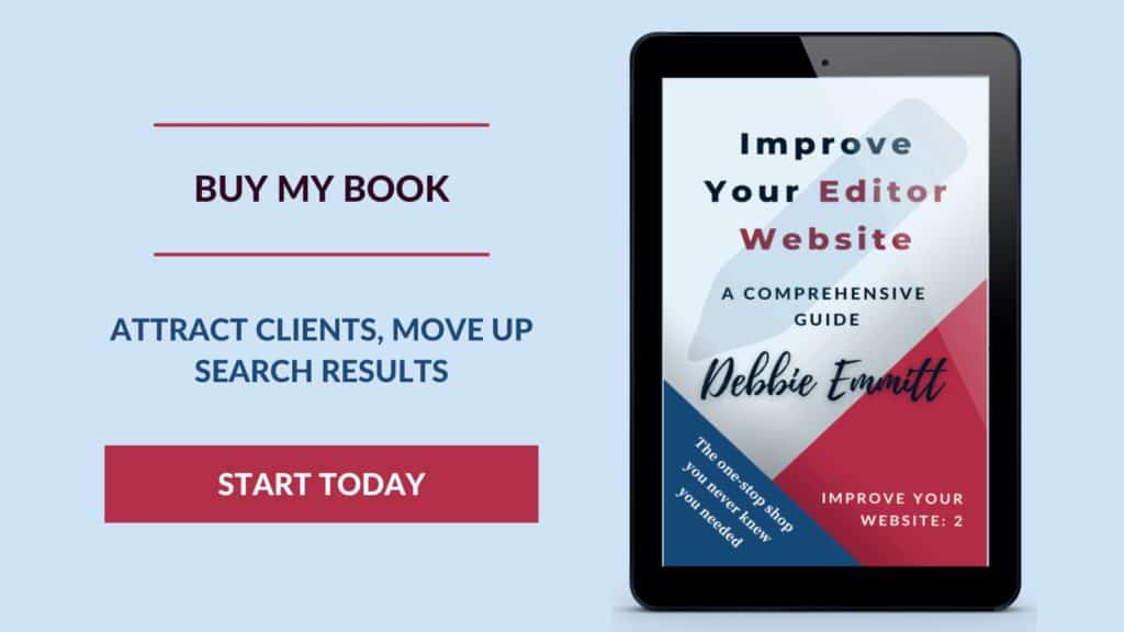
Editor and author
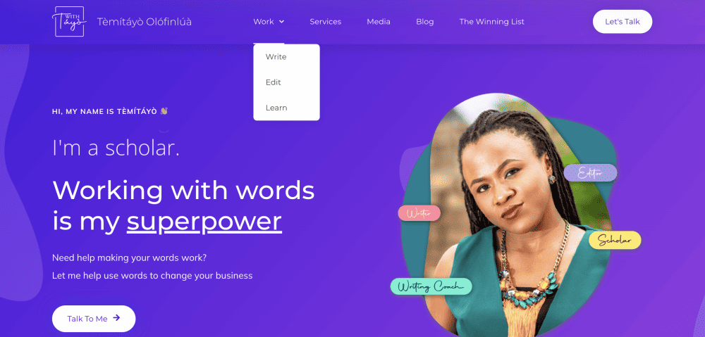
Many editors are also authors. If this is you, each ‘hat’ will need an online presence, which may affect your site structure. How you present your two roles will depend on whether you wish to keep them completely distinct, or whether you’d prefer a link of some kind.
There are three approaches to consider:
Separate websites, no linking
You may prefer to keep your roles of editor and author totally separate (maybe you write kids’ books but edit academic content, so there is no benefit in cross-marketing).
In this case, both roles will need a website, each with distinct branding, structure and content.
Separate websites, cross-linking
You may prefer to cross-promote your roles of editor and writer, especially if you write the same kind of content or in the same genre as you edit.
In this case, you may choose to have a separate site for each role to create individual branding and write copy targeted at the respective audiences, then link between the two sites for cross-promotion purposes.
Same website, different sections
If your two roles share the same audience, at least in part, and/or you don’t have the time or resources to manage two websites, you may choose to keep all your content on one site. You could have an over-arching homepage with links to subsites for each role or have items in the navigation that point readers to your writing and editing sections.
I am an editor/proofreader and a mystery author. Currently, I have one website for both roles, with one About page, one Contact page, and separate sections for my editing services and writing. Ideally, I would prefer a separate site for my author activities, as there isn’t much of a crossover between the audiences. However, due to the extra time it would take to manage two sites (plus two newsletters and two blogs), I have stuck with one site for now. If my writing takes off, I will probably separate my two roles online and cross-link.
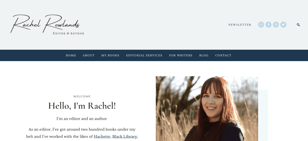
Learn more about improving your editor website
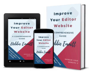
I’ve created a comprehensive guide on every aspect of improving your editor website.
It’s available on Amazon in paperback, hardback and Kindle formats, and via this website in PDF and/or EPUB formats.
If you sign up to my mailing list, you’ll receive an exclusive 20% discount off the PDF and EPUB formats purchased via my site.
Over to you
Drop a link to your editor site in the comments below. Let me know what obstacles you experienced when working out the structure, or any hurdles you’ve yet to jump over. I may be able to shed some light so you can move forward!



Gairika Proofreads
Thank you, Debbie. Since 2020, I have been working as a medical editor and proofreader in a freelance capacity for several academic publishers. Recently, I decided to launch my medical editing and proofreading business. I was creating my website from scratch on Wix. Your post helped immensely in designing the pages. Kind regards.
Debbie Emmitt
Hi Gairika, thanks for letting me know my post was useful! Feel free to share a link here to your site. That will help your SEO, too!