
Headers and footers are important elements of your author website. Learn how to get them right.
Your author website header and footer appear on every page of your site. If you use them well, visitors will instantly know your name, what kind of writer you are, how to easily navigate your site and more.
If you don’t use them well, visitors will be confused as to whose site they have stumbled across, whether your work is right for them and how to stay in touch.
Author website header
Your header is a key part of your author website. It’s the first thing visitors see when your page loads, when that crucial first impression is made.
The term ‘header’ used to refer to the area from the top of the page down to, and including, the navbar (main menu). While this is still often the case, increasingly the term is expanding, along with the size of the area itself. It now tends to incorporate more of the page body, as images become larger and designs become more encompassing.
Whatever you choose to do with your site header, here are some tips to help you strike the right tone and layout:
Include your name
Your author name should be immediately obvious. Put it in the middle of the header or to the left. Don’t place it on the right; this is not where visitors expect to see branding information.
Explain your genre, style or audience
Consider including a short tagline that clearly shows your genre, style of writing or the readers you are targeting.

Use relevant imagery
If you use a header image, ensure this reflects your genre or writing topics. Readers want to know what kinds of books you write. Publishers will be keen to see that you understand your product. There are plenty of free image sites to get you started.
Readers want to know what kinds of books you write. Tell them in your website header. #WritingCommunity #websites Share on XFuture-proof your header
Don’t choose an image that is only relevant to your current book. You’ll only have to change it later. By all means, do this on a book-specific site, but on your author site keep it relevant to you, not to one specific book.

Place input boxes top right
If your site has an internal search or a login function, users will expect to find these top right in the header. If you have neither of these, consider putting a sign-up button to your email list.

Author website footer
Your site footer also appears on every page. It can help visitors who have scrolled to the bottom of a page and have failed to find what they need (either because they’ve missed it or it isn’t there).
There is no definitive rule for what you can include, but most users would expect the following:
Social media links and contact information
Even if these feature higher up the page, include them again in the footer. People expect to see them here, and it makes it easier for folks to get in touch with you.
Call to action
If people are on a subpage that doesn’t have your email sign-up button in the page body, they can easily access it here.
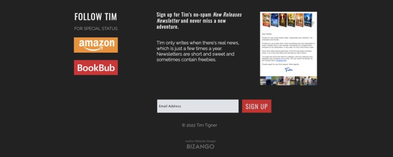
Copyright notice
Your website content is protected by copyright law whether or not you include this notice, but it’s always good to make this clear. In your notice, show the copyright symbol, the year of your site’s publication and your name. You can also include the word “copyright” for clarity.
Your website content is protected by copyright whether or not you include a copyright notice in your footer. #WritingCommunity #websites #copyright Share on XFor example, Copyright © 2024, Joanna Bloggs. If your site includes content published over a range of years, include that, eg. Copyright © 2022–2024, Joanna Bloggs. (Note the en dash in the range of years, not a hyphen … that’s the perfectionist editor in me jumping out!)

Website designer’s name
If you hired a professional designer to create your site, you could put their name in your footer.
Other footer elements
There are many other elements you can include. Be careful, though, not to overcrowd the area. Some ideas for other content are:
- site navigation
- recent blog posts
- thumbnail of you and a short piece of teaser text, maybe taken from the shortest version of your bio
- awards
- reviews
Your turn
What do you have in your author website header and footer? After reading this post, are you thinking of making changes? Let me know in the comments!



Leave a Reply