
Your author homepage needs to clearly show who you are and what you do, while enticing people to delve deeper into your site. Here’s how.
Your homepage is likely to be the most visited page on your site. Even though it is not necessarily the starting point for every visitor (they may have arrived at your About page or a blog post via Google, for example), it is the web address you promote, and where visitors return if they need to reorient themselves on your site.
Think of your author homepage like a magazine cover. It is not a place where users will hang out for long, but it needs to showcase the items that are of most interest to them and encourage them to dig deeper. It is, therefore, of vital importance to make it easy to use.
Think of your author homepage like a magazine cover. It isn't a place where readers will hang out for long, but it needs to showcase the items that are of most interest to them and encourage them to dig deeper. Share on XHave a clear goal
You will have a number of aims for your site: for example, increase subscriber numbers, sell books and get people to learn more about you, but there will be one primary goal specific to you. Make this goal clear on your author homepage.
For example, if your main goal is to promote your latest book, and a secondary goal is to increase your subscriber list, you will dedicate a large proportion of homepage space to a quality visual of your book with some marketing blurb, and a clear link to purchase outlets (Amazon etc).
The secondary goal can be met too, but don’t let it compete for space with the book-marketing content. Instead of taking up prime real estate with your sign-up form on the homepage, just have a clearly visible button in the header or footer so that it isn’t jostling for pole position.
See how Matthew Mather does it.
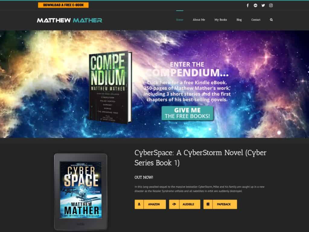
Of course, your goal may change over time, or at different times throughout the year, so just tweak your homepage accordingly.
If you’re an unpublished author, find out what you can put on your homepage and the three other essential pages for your site.
Keep it simple
Don’t feel you have to cram everything onto your author homepage, or visitors will become blind to it all. Think about the parts of your site that will be of most interest to your audience and make sure these have a spot. Think about the user journeys of your visitors, and make sure the first steps exist on your homepage.
Your author homepage is a valuable space. Each piece of content must be working for you. If it isn’t, get rid of it.
Allow scrolling
Users these days expect to scroll, especially if using a tablet or mobile phone. Give yourself room to include essential content without feeling everything has to be at the top of the page (although make sure your main goal’s call to action is visible when the page first loads).
Say who you are
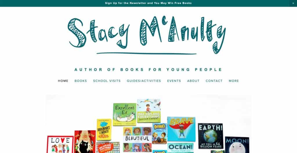
More than just your name should be at the top of the page. Give new readers a short, clear idea of your genre and any proof of success. If you have won awards, say so. For example, “Joanna Bloggs, author of mystery and romance. New York Times bestseller.”
Ideally, this should be in your header, so that it appears on every page and not just your homepage. People may not arrive at your site via your homepage, so telling them what you are about on all your webpages will help them. See how Stacy McAnulty does it.
Promote your latest book
Many visitors will be coming to your site to find this information, and it will be the primary goal for a lot of authors. Put this information front and centre on your homepage; don’t make people go searching for it. Include a visual, a short synopsis or tagline, and a link to the subpage about your book. Also include a link to where people can get a copy.
If you are an established author with a back catalogue, you could include thumbnails (smaller images) of your other works, or list them concisely. Link to the respective subpages so people can find them easily.
Include a call to action
A call to action is content that induces visitors to act, eg. a ‘Sign up’ button.
As the most visited page on your site, the homepage is a crucial conversion area, so use it wisely. If you have an email newsletter, make sure people can sign up from your homepage.
If you are a published author, include a link to where people can buy your book.
No welcome message
Show don’t tell. People don’t need to be told they are on your site, they already know. Similarly, avoid telling them what they will find on your site. So avoid sentences like: “Welcome to the homepage of Joanna Bloggs. Here you will find…”
Instead, make it clear who you are and what you do in your header, or high up in the page body, and point the way to key content through links and calls to action.
People don't need to be told they are on your website; they already know. From: Author homepage – what to put on it and why Share on XCheck for errors
Before you launch your homepage, make sure you check for any typos and errors in grammar, spelling and punctuation. Also look at the layout on different devices and in different browsers to make sure everything is acting as it should.
Consider hiring a professional web proofreader (I’m one, but it doesn’t have to be me!) to take a look over your homepage, even your whole website. You may be too close to the content and keep glossing over little mistakes that will reduce the credibility of your site and of you as an author.
Publicise!
Once your author homepage is something you can be proud of, promote it wherever and whenever you can. Start here, by leaving a comment with a link to your site. This will increase your domain authority and give you more exposure. And of course, I’d love to take a sneaky peek!





Leave a Reply